Top 15 Logos That Make You Think!
Greetings, logo enthusiasts and pondering minds! Today, we embark on a delightful journey into the world of logos that ignites our imagination, sparks curiosity, and makes us think. From clever symbolism to hidden meanings, these 15 logos from renowned companies will take you on a thought-provoking adventure. Buckle up, and let’s dive into the colourful and whimsical realm of logo design!
Amazon
Our first stop is the ever-famous Amazon logo. Notice that the arrow underlines the company name, cleverly pointing from the letter ‘A’ to the letter ‘Z.’ It symbolizes their vast product range, suggesting that they have everything you need, from A to Z. Mind-blowing, isn’t it?
FedEx
Prepare to have your mind blown with the FedEx logo. Take a closer look between the ‘E’ and the ‘x.’ Can you spot it? Yes, a hidden arrow is cunningly created within the negative space, representing speed, precision, and forward-thinking. It’s so sneaky, yet so genius!
Toblerone
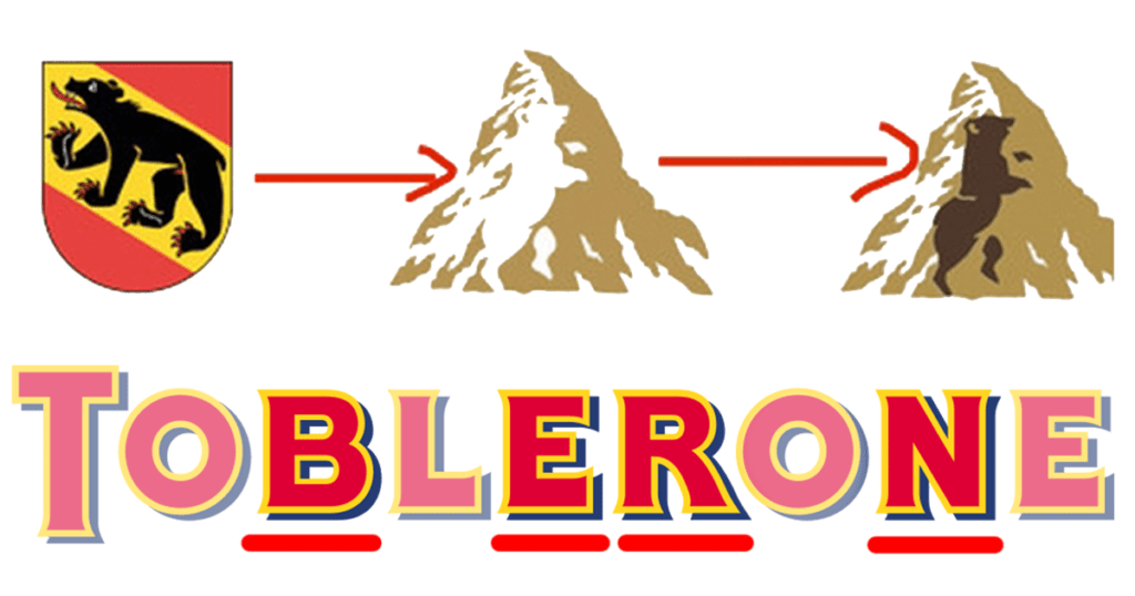
If you’re a fan of chocolate, you’ll appreciate the Toblerone logo. At first glance, you’ll see the majestic Matterhorn Mountain. But wait, there’s more! Gently gaze at the negative space, and you’ll uncover a playful silhouette of a bear, an ode to the Swiss origin of this delicious treat. Sweet, both literally and figuratively!
Cisco
Get ready to contemplate the deeper meaning behind the Cisco logo. A closer inspection reveals blue lines that resemble a digital signal, representing connectivity and technology. But there’s a hidden gem! Look carefully, and you’ll find that these lines also form a stylized representation of the Golden Gate Bridge, signifying the company’s birthplace in San Francisco. Talk about brilliant symbolism!
Baskin-Robbins
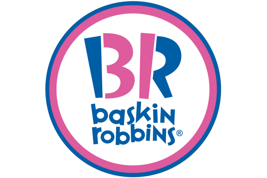
Ice cream lovers, unite! Baskin-Robbins’ colourful logo has a delightful surprise hidden within it. Take a closer look at the ‘B’ and ‘R’ in the company name. Notice anything peculiar? Yes, the pink portion of the ‘B’ cleverly merges with the ‘R,’ forming the number ’31.’ Voilà, 31 flavours! It’s an ice cream lover’s dream come true.

Time to pin down some inspiration with the Pinterest logo. While it may seem like a simple letter ‘P,’ there’s more to it. The negative space within the letter forms a pin, representing the platform’s core functionality. Pinning your interests with a stylish twist!
LG
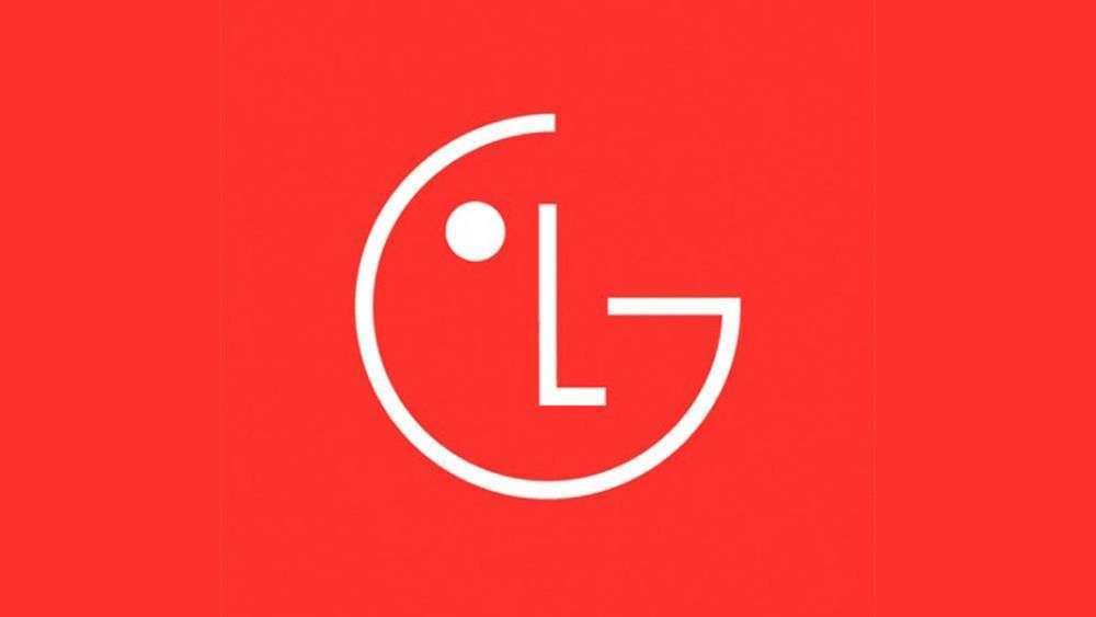
You might have seen the LG logo countless times, but have you noticed its clever transformation? It’s a combination of the letters ‘L’ and ‘G,’ forming a winking face! It conveys the company’s tagline, “Life’s Good,” and adds a touch of playfulness to its branding.
Tour de France
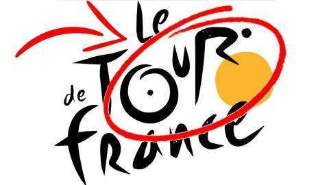
Bicycling enthusiasts, this one’s for you! The Tour de France logo takes its inspiration from the spokes of a bicycle wheel, forming a stylish representation of a cyclist. The creative use of negative space showcases the elegance and athleticism of the sport. Pedal your way to logo appreciation!
Carrefour
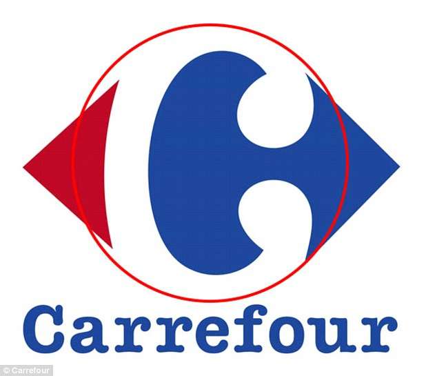
Prepare to be enchanted by the Carrefour logo. At first glance, it seems like an ordinary letter ‘C.’ But wait, look closely! The white space within the letter forms a hidden ‘C’ as well, adding a touch of intrigue and symmetry to their brand identity. Simply captivating!
Sony Vaio
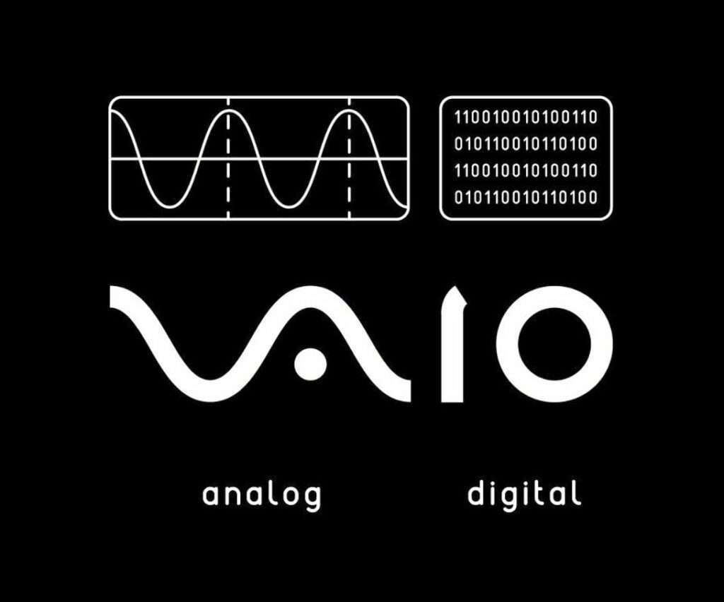
Tech aficionados, pay close attention to the Sony Vaio logo. The ‘V’ and ‘A’ represent an analog symbol, while the ‘I’ and ‘O’ stand for binary code. This fusion perfectly captures the company’s expertise in both analog and digital technology. It’s a logo that harmonizes past and present!
Goodwill

The Goodwill logo effortlessly combines the ‘G’ with an enigmatic blue smiling face. But did you know that the arc of the smiling face subtly forms the shape of a lowercase ‘g’? It represents their mission to help people discover their full potential and create a positive impact in the community. Talk about spreading smiles!
NBC

Lights, camera, logo! The iconic peacock in the NBC logo is more than just a colourful bird. Each feather represents a division of the network, from news to entertainment. The peacock symbolizes the network’s commitment to providing a vibrant range of programming. It’s a logo that truly spreads its wings!
Tostitos
When it comes to snacking, Tostitos knows how to capture our attention. Their logo incorporates two friends sharing a Tostitos chip, while the negative space between them cleverly forms a bowl of salsa. A chip-dipping design masterpiece!
Beats by Dre

Groove to the rhythm of the Beats by Dre logo. The lowercase ‘b’ in the logo is enclosed within a red circle, which closely resembles a human head wearing headphones. It symbolizes the immersive and captivating music experience their products provide. Let the beat drop!
London Symphony Orchestra

Our grand finale takes us to the world of classical music. The London Symphony Orchestra’s logo, seemingly simple at first, unveils hidden musical notes formed by the conductor’s baton. This intricate detail harmonizes the essence of symphony and the artistry of their performances.
There you have it, dear readers—15 logos that transcend aesthetics and make you ponder their ingenious designs. From hidden messages to playful symbolism of logos, these logos beautifully merge creativity and branding to captivate our imagination.
So, the next time you come across a logo, take a moment to let your mind wander and unravel the layers of meaning woven within. Happy logo pondering!
